Step by Step Assemble Process for a Simple, Easy 9x12 Pocket Page Spread! | Featuring Roam by One Little Bird Designs
Hi guys! Today I thought I'd share a little something more than just a recent layout. I thought perhaps you'd like to know a little behind my thought process when choosing and printing digital cards for my hybrid pocket.
Note: This blog post contains affiliate links.
To begin with, I usually choose cards and digital elements, from the same collection by the same designer. This helps create a cohesive spread and ensure all the details will tie my pocket page spread together. For the layout I'm sharing today, I chose to use the new Roam collection by Peppermint Granberg of One Little Bird Designs. When I saw this collection in the Lilypad store, I immediately new what set of photos I'd want to use with it. That is how most of my layouts happen. I always pair a collection with a story I want to tell, envisioning a set of specific photos with that collection. Usually the colors in my photos and the collection play a big part in which sets I envision together.
Since I had so many photos for this spread, I chose to do two 9x12 pages with a 3x12 insert that allowed me space to add six extra 3x4 slots. I started with printing my photos (I use a professional lab) and then trimmed the photos down and insert them into my trimmed down Design F Page Protectors from Becky Higgins LLC and used my We R Memory Keepers Fuse tool to split the top 4x6 pocket into two 3x4 spaces.
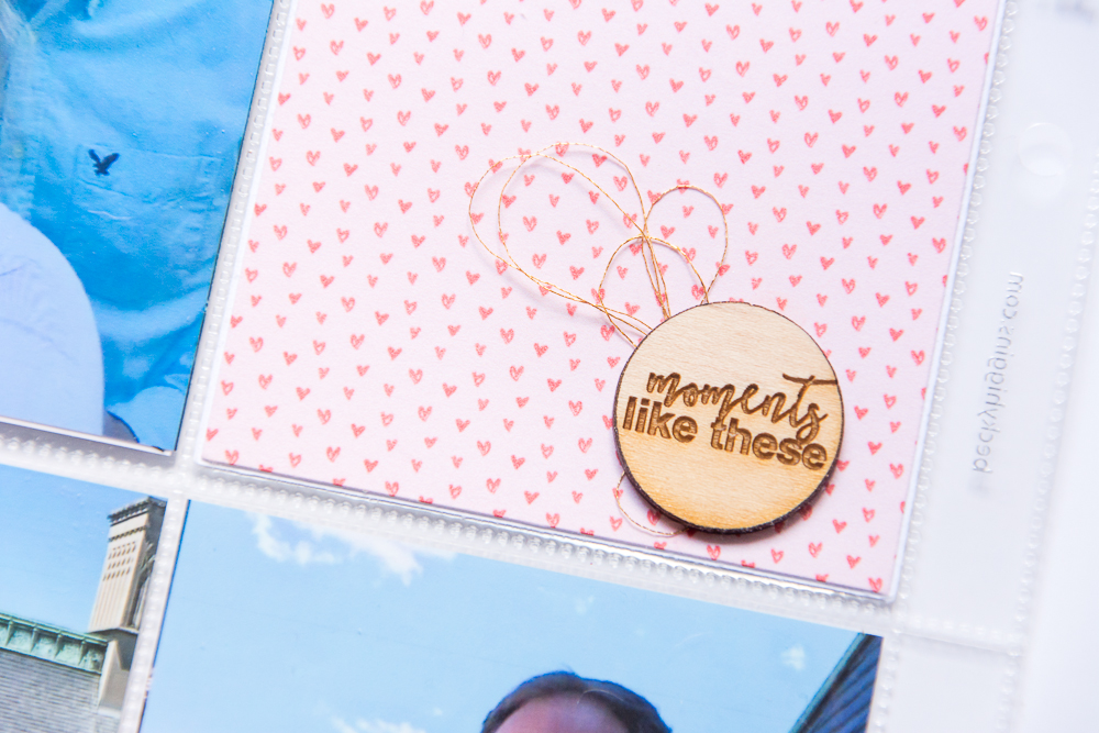
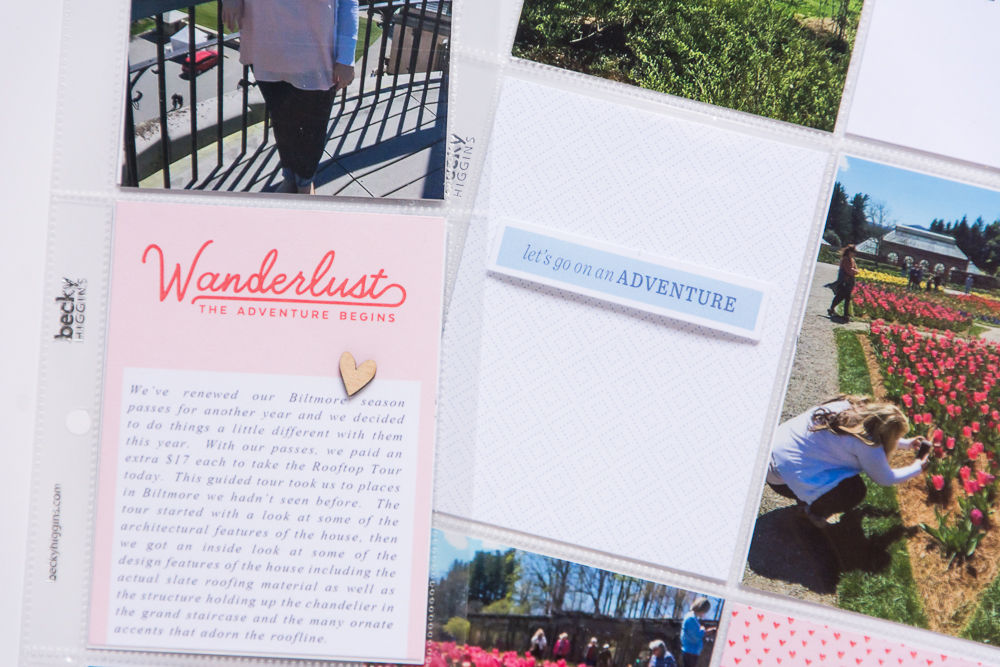
Next, when I knew how many blank spaces I had to work with to insert journal cards, I began choosing journal cards and elements that matched the colors in my photos and opened them in Photoshop Elements. When selecting which cards to use, I do two things - I typically always repeat a pattern. In this case, I chose to repeat the pink heart pattern and use one card on each side of the spread. In addition, I also repeated the large words Go and Explore, in the same color green for each side of the layout. I arranged these cards and the elements I wanted to print onto 8.5x11 white cardstock and printed them on my Canon Pixma printer at home. I then used a paper cutter to trim down the journal cards and insert them into my pockets.
Secondly, I repeated my elements as I assembled my pockets. As you can see I used a wood veneer embellishment and phrases adhered with foam tape on each side of the layout. This really helps bring everything together when the layouts are viewed in the album.
Lastly, when I arrange my extra cards on my layout, I always try them in different positions first, moving things around until I feel like I have a well balanced layout using white space, repeating patterns and elements.
... and that's it! That's my simple, easy formula for creating consistent pocket page spreads! I hope this mini tutorial was enjoyable for you and if you liked what you read or have any questions for me, let me know in a comment below. I'd love to hear from you and answer any questions.
Note: Some of the following links are affiliate links, which means I receive a commission based on sales generated via these links.
Products Used: Roam journal cards, elements and papers by One Little Bird Designs | Daily Grind wood veneer and Splish Splash wood veneer camera from Color Cast Designs | Becky Higgins Design F Page Protector (trimmed down and Fused).


