2016 Guide to Scrapbooking | Using What Worked and What Didn't Work
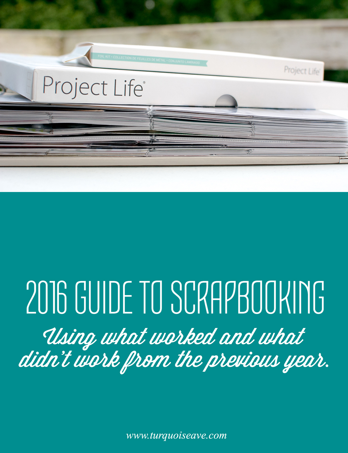
Pin This: A comprehensive guide to scrapbooking in the new year using what worked and what did not work in the year past.
Being almost three weeks into the new year, I have YET to start my 2016 album. And I'm OK with that. Perhaps you're finding yourself in the same boat right now?
I've been working hard on filling in all the gaps in my 2015 album and completing layouts using my stash of supplies. In my three years doing an annual album, I've found that this slower season is GOOD for me. I can take this time to review last year's process as it has evolved over the months and take note of what worked and what did not so I can improve as I go into the new year with new memory keeping goals.
Note: Some of the following links are affiliate links, which means we receive a commission based on sales generated via these links.
2015 Positives
- White space - I really love the clean, fresh look that white space gives my layouts.
- Paislee press templates for journaling - I am obsessed with these templates. They are PERFECT for journaling a large or small amount and give the entire album a cohesive feel.
- 6x8 Album Size - Unlike the big, clunky feel of a 12x12 album, my smaller physical albums visually appealed to me. The only drawback to 6x8 is the limited number of spreads per album due to it's size.
- 6x8 Digital Spreads - In the past, I'd done only 12x12 scrapbooking both with the Project Life app and in Photoshop Elements. This year, thanks to Little Lamm & Co.'s 6x8 templates, I began creating 6x8 digital spreads exclusively. Cue the warm fuzzies... I enjoyed the fact I could create spreads on my laptop while spending an evening with the hubs watching a movie.
- Inserts and titles - Looking back over my spreads, some of my favorite things in my physical spreads were my vellum inserts and title pages. This is one thing I'm definitely going to continue.
- Wood Veneer - I can't live without my wood veneer embellishments. End of story.
- Black and White is my jam. Every layout that had black and white cards with pops of color made my heart really, really happy.
- Hybrid Journal Cards - By setting aside time to plan my layouts and which digital journal cards I wanted to print at home, I saved money buying packs of pre printed cards, I only printed what I needed, and had so many more options available.
2015 Negatives
- Too many photos/too many similar photos - my poor 2015 albums are bulging at the seams, including my 12x12 annual album and my December Daily. Reviewing my annual album and the photos I took, proved that I take way too many photos of my dog and similar things. I need to be more intentional about what I print and the story it tells.
- Colors changing too often/not cohesive - Oh goodness, at times flipping through my album, I cringed. I had a pretty layout with beautiful, soft neutrals next to a layout with neon and bright bolds jumping off the page. I'd shake my head and think, "What happened to cohesive???"
- Thick elements make the pages bend - One of the reasons I began selling my flat, cork stickers is because using chunky elements like acrylics and flair pieces in my album layout after layout made my page protectors bulge and crinkle. While I'm sure I'll still use these things from time to time (with friends like Feed Your Craft and Color Cast Designs woo'ing me), I just need to space them out more.
- Collect app - I love the Collect App for keeping up with daily photos and notes. In the beginning of the year, I printed 3x4's from exports via the app. It was so easy to journal this way... But halfway through the year, I missed having full size photos and tired of the same look layout after layout.
- Buying Journal Cards (in the store) - Halfway through the year, I stopped buying journal card packs in my local craft stores. I simply needed to avoid having oodles of cards, duplicates of the same design and I was really loathing those rounded corners. lol.
Now that I've decided what worked and what did not, my intentions for the new year are these:
2016 Annual Album | Print only photos that tell a story - work these photos and stories into two 6x8 binders for the year.
2016 Digital Album | Create 6x8 digital spreads using my everyday photos, the Project Life App, and templates in PSE. Print these layouts at the end of the year via Artifact Uprising.
Continue using elements such as title cards, inserts, and vellum in addition to embellishments that are flat and trendy. Also, plan my pages more in advance to be certain I'm using coordinating colors with the surrounding spreads. I also believe for the sake of uniformity and consistency, I may even repeat some of the same layouts and visuals throughout my albums this year.
What about you? What have you found that has worked for you vs. what has not worked? I'd love to hear all about it in a comment below or make a list and tag me in it on Instagram or social media!